1 / 3
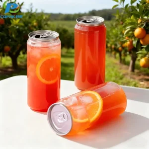
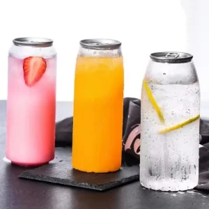
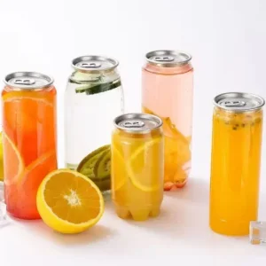
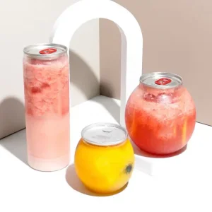
The beauty of a clear PET can is its transparency, but it also presents a unique challenge: how do you design a label that enhances, rather than hides, your product? A well-designed label on a clear PET can isn't just an afterthought; it's an integral part of the visual experience, creating an impactful "no-label look" that highlights your product's appeal.
Here’s how to design a label that truly stands out on a clear PET can:
Strategy: Instead of a solid, opaque label that covers the entire can, use transparent or semi-transparent label materials. Print only your logo, key information, and graphics directly onto the clear label.
Effect: This allows the product inside to be the star, creating a clean, minimalist, and sophisticated aesthetic. It signals premium quality and freshness.
High Contrast: Use bold, opaque colors for your brand name and logo that pop against the product's natural color. For example, a crisp white logo on a dark cold brew coffee or a vibrant blue on a yellow juice.
Strategic Color Palette: Choose colors that complement or contrast beautifully with your beverage. Avoid colors that clash or get lost against the product's hue.
Technique: Consider printing elements on both the front and back of a transparent label. When applied to the can, this creates a subtle layering effect and visual depth as the consumer looks through the product.
Example: Your logo on the front, and a subtle pattern or ingredients list printed on the reverse side of the label, visible through the liquid.
Shine Bright: Metallic inks (gold, silver, bronze) or pearlescent finishes can add a touch of luxury and catch the light beautifully on a clear can. This instantly elevates perceived value.
Texture: Incorporate tactile varnishes or raised inks to add a sensory element to your label design.
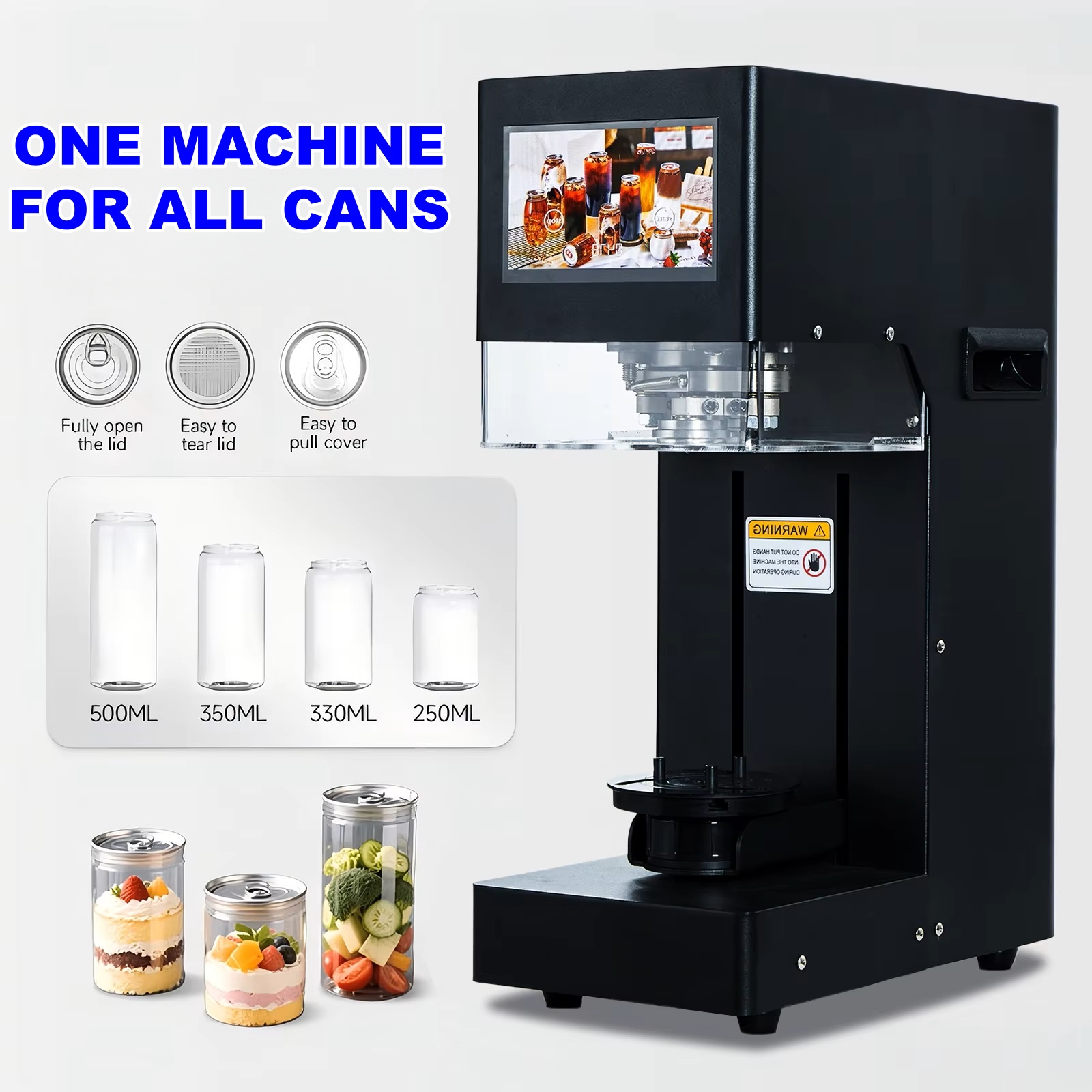
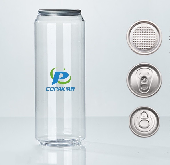
Contour: Labels need to conform perfectly to the can's cylindrical or U-shape curvature without wrinkling or bubbling. Ensure your label supplier understands the specific dimensions and nuances of your chosen PET can shape.
Vertical Space: Utilize the vertical space effectively for branding and storytelling.
Less is More: With a transparent can, too much information or busy graphics can overwhelm the product's natural beauty. Prioritize essential branding, product name, and key benefits.
Legibility: Ensure text is easily readable against the product's background, considering both natural and artificial lighting conditions.

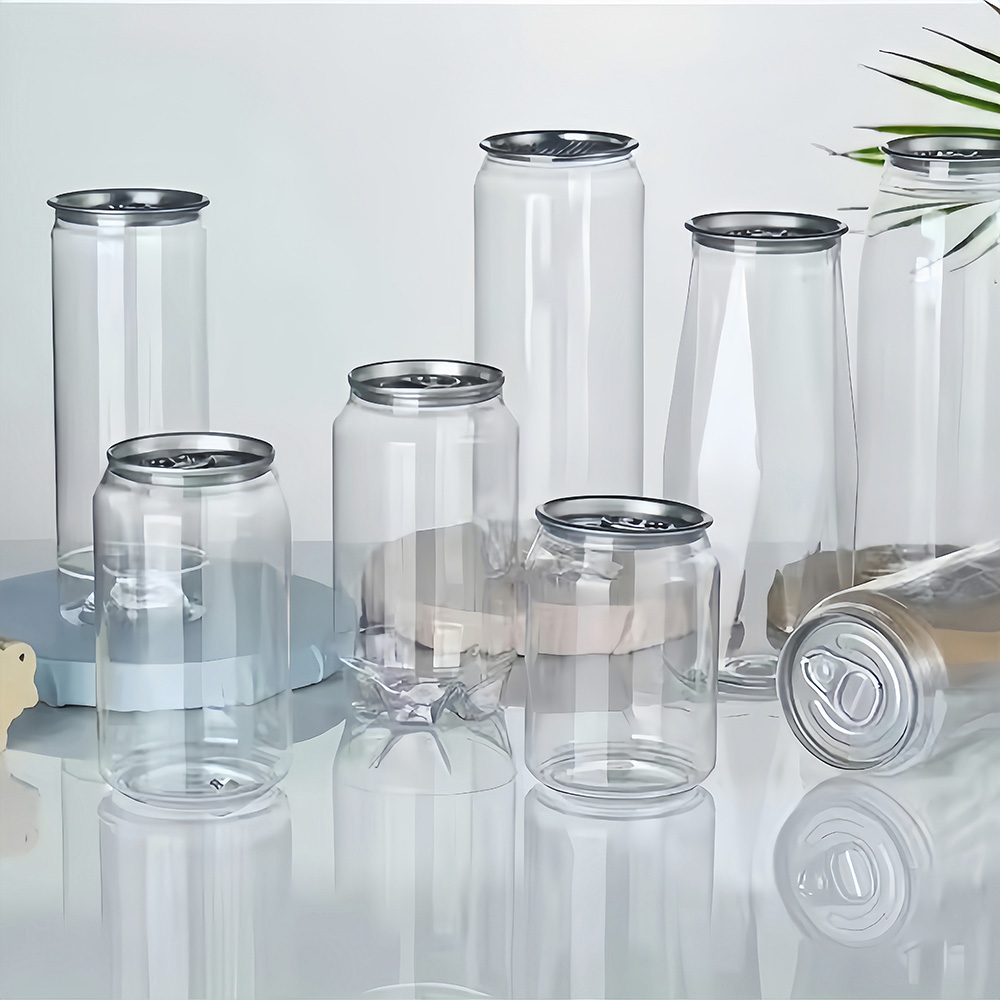
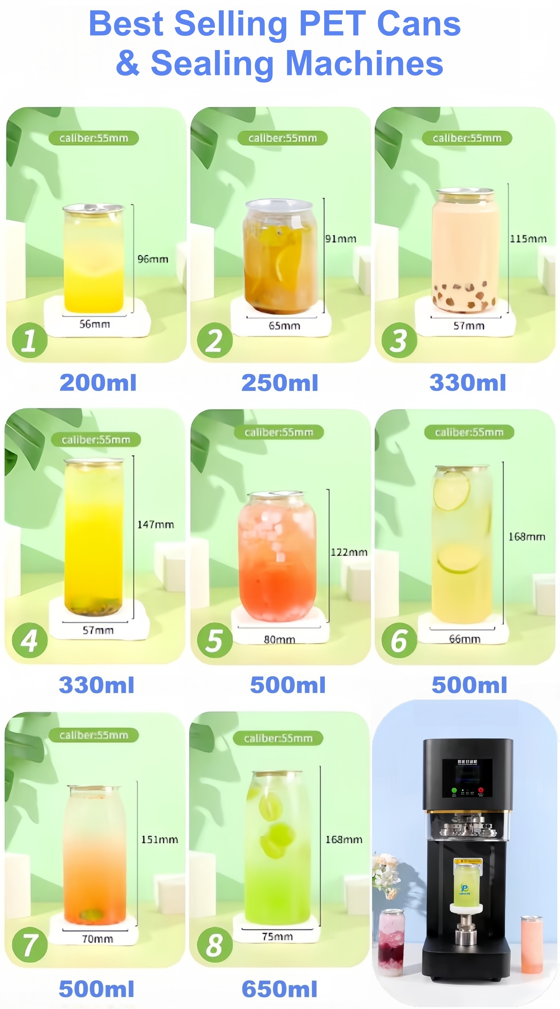
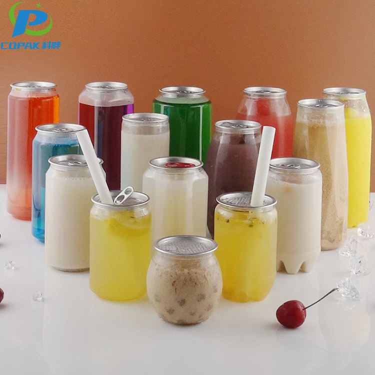
The "no-label look" uses transparent or semi-transparent label materials. Instead of standard opaque backing, only the essential graphics, logos, and product information are printed onto the clear material, allowing the product inside to remain fully visible.
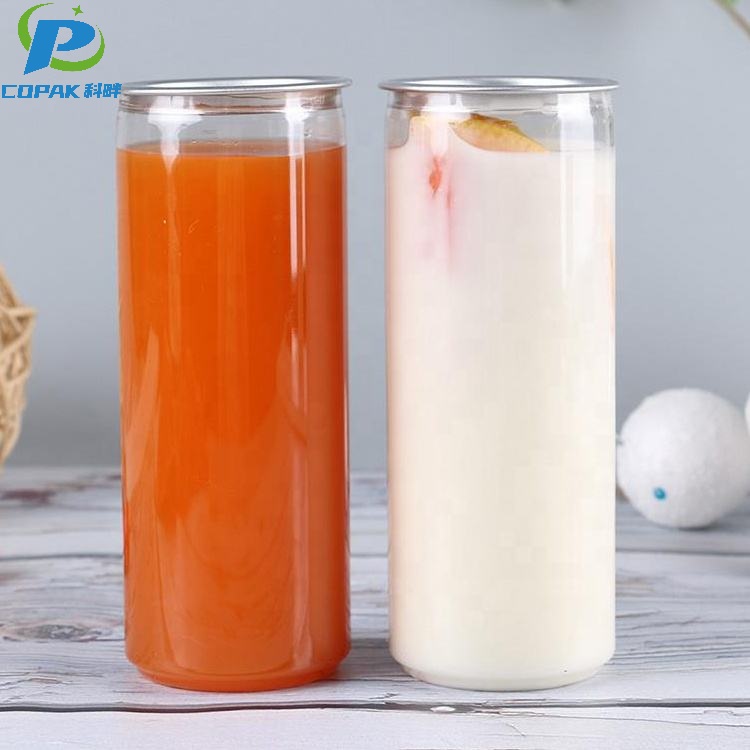
You should choose high-contrast, opaque colors for your branding elements. For instance, using solid white text on dark liquids (like iced coffee) or deep blues on light liquids (like lemonade) ensures your message stands out clearly.
This technique involves printing graphics on both the front and the back side of the label material. When wrapped around a clear can filled with transparent or semi-transparent liquid, it creates a unique sense of depth and 3D layering.
Yes. Metallic inks like silver, gold, and bronze, as well as pearlescent and tactile raised varnishes, work exceptionally well on clear PET cans. They catch natural light easily and give the product a premium, luxurious feel.
To prevent bubbling or wrinkling, your label must be contoured and sized precisely to match the U-shape or cylindrical curve of the PET can. Work closely with your label manufacturer to get exact structural templates before printing.